Visual merchandising is how you arrange and show products so shoppers notice them and buy. In a shop it is the window, the table by the door, the shelf at eye height and rails grouped by color. Online, the same work falls to the first row of a collection, product photos, badges, color swatches and the homepage.
You have no window and no table by the door. You have a collection page, and its first card is a sold-out jacket shot on a different background from its neighbors. That grid is where your visual merchandising happens.
What does visual merchandising mean?
Visual merchandising is the part of selling that shoppers see. Shopify's guide calls it "planning and designing product displays that attract customers and increase sales."
Merchandising is the wider choice of what you stock and which products you push. Visual merchandising is the display that carries those choices. The merchandising definition covers the wider job, and the ecommerce merchandising guide shows how to run both on Shopify. On a small store, the visual merchandiser is you.
What is visual merchandising in retail?
In a shop, visual merchandising turns color, lighting, layout and signs into moves you have walked past many times.
- The window display tells people on the street what the shop sells and gives them a reason to come in.
- The table by the door sits a few steps inside, since shoppers take in little in their first steps past the entrance.
- Eye level is where the shop puts what it most wants sold.
- Color blocking sorts a rail into bands of color, a staple in clothing shops.
- Signs and price cards give a shopper one reason to look closer.
- Cross-merchandising hangs the belt beside the trousers, so the second sale is within reach.
- A planogram is the drawn plan of which product goes on which shelf, so every branch of a chain looks the same.
Where a product sits can change how much of it sells. In a field experiment across 214 stores of a German perfumery chain, eight products moved from their usual shelf to displays near the checkout, at the same price. Their unit sales rose 80% to 478% against the control group, depending on the product. The authors call the extra revenue low and tell shops to weigh it against what the displays cost. On your own store, compare a product's sell-through rate in the weeks before and after you move it.
What is visual merchandising in ecommerce?
It is the same work on a screen. Online the shelf never ends, but the view before a shopper scrolls does. On a desktop screen, people spent about 57% of their page-viewing time above the fold, that first view, in Nielsen Norman Group's 2018 eye-tracking study.
Every shop job has an online twin, with a setting you control on Shopify.
| In a shop | On an online store | Where you set it on Shopify |
|---|---|---|
| Window display | Homepage banner and featured collection | Your theme's homepage sections |
| Table by the door | First row of each collection | The collection's sort order, or an app rule |
| Eye level | The first screen, before anyone scrolls | Collection order and banner height |
| Rails sorted by color | Color swatches on cards and in filters | Color entries on your products and a theme that shows swatches, or a swatch filter |
| Shelf signs | Product badges | Your theme's Sale and Sold out badges, or a badge app |
| Belt beside the trousers | Cross-sells and other recommendations | Your theme's related products, or an app |
| Seasonal display | A sale banner and a product order that start and end on set dates | "Rollouts", Shopify's scheduler under Markets, for theme changes on the Basic plan and up; a dated collection order takes an app |
| Planogram | The saved order of each collection | Its sort order and any rules on it |
Two things are new online. Visits and orders are counted, and you can test a change against the version you run now. In Rollouts that test is an "Experiment", on the Grow plan and up. Shopify A/B testing covers how to run one you can trust.
Visual merchandising examples on a Shopify store
On a Shopify store, the collection page is the shop floor.
The first row of a collection
You want this week's best sellers up top, and a sold-out jacket sits in the first slot instead. No Shopify sort reads stock, and "Best selling" adds up all-time orders, so a sold-out card or last year's hit can stay in front. Pick "Manually", the order you set by hand, and you can drag products or move the ones you tick "To the beginning".
Sledge is a Shopify app for search, filters and merchandising rules. Its "Pin" rule holds the products you pick at the top, and a boost rule can lift "Best sellers" of the last 7, 14 or 30 days. "Move Sold Products to the end of product listing" keeps sold-out cards behind the ones you can ship. All three work on the collection pages Sledge shows, with its "Product Filter" tool on.
Five merchandising rules that lift sales help you choose what goes first, and the post on pushing out-of-stock products to the bottom has the sold-out fix in full.
Photos that match
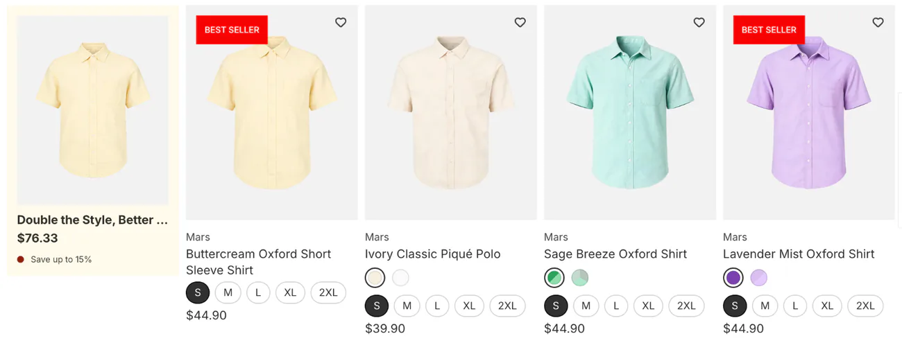
One photo sits on white, the next on a wooden table, and the cards come out at different heights. The grid looks messy before anyone reads a price. Shoot every product in a collection on one background, with one crop and one shape.
Your theme's product card usually has a setting for the picture's shape. In Horizon it is "Aspect ratio", with Auto, Portrait, Square and Landscape, and Portrait as the default. It fixes the shape, not a mixed background, so the photo on the wooden table still needs a reshoot.
Badges
This week's arrivals need a New badge, and your theme may offer only two. Horizon and Dawn show Sale and Sold out product badges on cards on their own, and Horizon's "Position on cards" setting picks the corner. Anything else, like New or Low stock, takes an app or a developer.
In Sledge's badge form, you type the "Badge label", pick its corner under "Badge position", and set "Active dates" so a New badge comes down on time. "Inventory conditions" can show it only while a product is in stock, or only while its stock is at least, or at most, a count you set. The badge goes on the products or collections you pick.
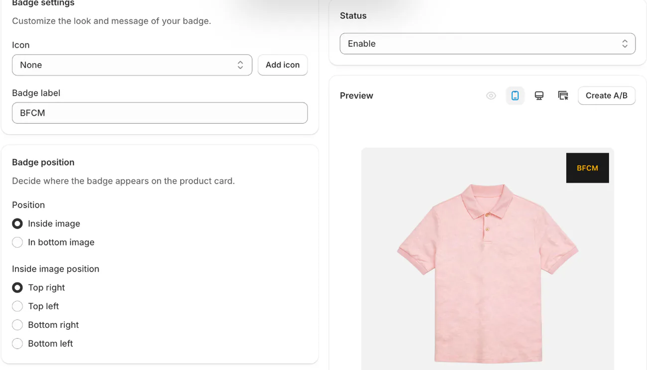
For Horizon in detail, read how to add product badges to the Horizon theme.
Color swatches
Your product cards say "3 colors" instead of showing them, or the dots appear only on hover. On phones, 57% of sites leave some colors off their product cards for products people choose by look, Baymard found. Some shoppers then take the colors they see as all you sell.
Shopify's own route is to give each product a category, add color entries for it, link them to the product's color option, and use a theme that shows swatches. Sledge's "Color Swatch" tool maps the color names in your product options, tags, collections or custom product details to swatches in the filter. When you have hundreds of colors, you can upload them in one spreadsheet.
For the filter route on Dawn, read how to show color swatches on Shopify collection pages.
A banner between products
You want a sale banner inside the collection, after the first eight products, and not only above them. Most themes put a collection banner above the grid, not among the cards.
In Sledge, a merchandising rule can place a promo banner you already run at a position number in the grid, and "Position 1 is the very top of the list." The banner sits beside the products and pushes none off the page. Like Pin, it works on the collection pages Sledge shows.
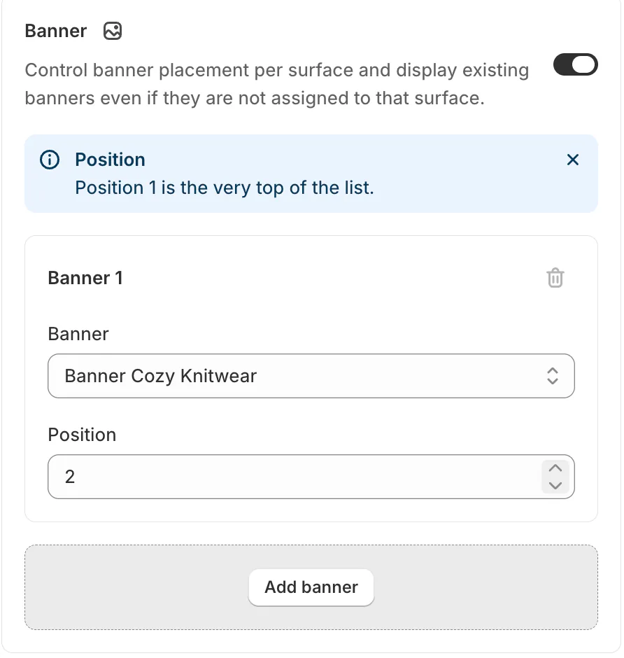
Pin, boost rules, badges, color swatch filters and banner placement come with all four paid Sledge plans, from Pro at $29.99 a month.
Search results are a shelf too, and searchandising is the same work there. The product listing page post takes the collection page apart, piece by piece. To check your own store, collections included, run a Shopify store audit.
FAQ
Questions, answered
-

14-day free trial
Explore Sledge on your store before you decide to commit.
-

No credit card required
Start improving your store with no upfront commitment.
-

Setup in minutes
Get Sledge running without a lengthy setup process.
-

Built to grow sales
Turn shopper behavior into actions that help you sell more.
What is visual merchandising in simple words?
Visual merchandising means showing products so they sell. You decide what a shopper sees first, what sits beside what, and how it all looks: the window, the table by the door, a rail sorted by color. Online it is the first row of a collection, matching photos, badges, color swatches and the homepage banner.
What is the difference between merchandising and visual merchandising?
Merchandising decides what you sell and which products get attention: the range, the price, the order. Visual merchandising is the part shoppers see, the display that carries those choices. On a small store one person does both. The merchandising definition goes deeper, and the ecommerce merchandising guide covers Shopify.
Why is visual merchandising important?
Because shoppers buy what they notice. In a field experiment across 214 stores of a German perfumery chain, eight products that moved from the shelf to a display near the checkout sold 80% to 478% more units than the control group. The authors call the extra revenue low, so a display has to earn back what it costs.
What is a planogram in visual merchandising?
A planogram is a plan that shows where each product sits on a shelf or fixture, so every branch of a chain sets it out the same way. Online stores have no shelves, so the nearest thing is the saved order of each collection: which products lead, which follow and which sit last.
Can you do visual merchandising on Shopify without an app?
Partly. You can sort each collection or order it by hand, and Horizon and Dawn show Sale and Sold out badges. Swatches need color entries on your products and a theme that shows them. Rollouts can schedule a homepage change. One order across collections, dated badges and, on most themes, banners inside the grid take an app such as Sledge.
Your first row, set on purpose.
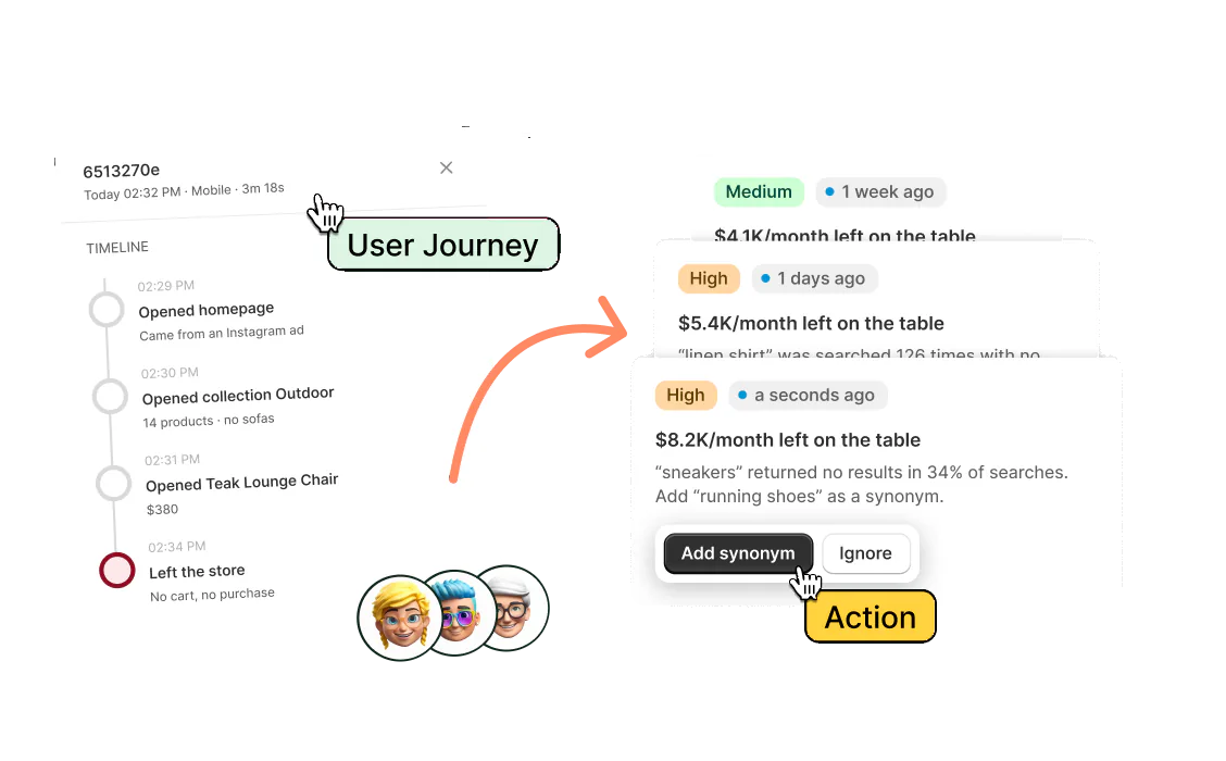
Try Sledge free for 14 days and set the first row of your collections by hand or by rule, with dated badges and banners inside the grid. Growth Intelligence turns on when you pick a paid plan. It spots products sitting unsold while no rule runs and suggests a pin or a boost. Its fixes add up to one monthly dollar total, labeled "Est. potential".