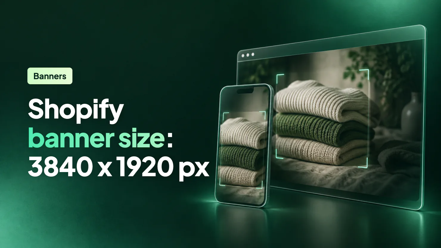
The safest Shopify banner size is 3840 x 1920 px (2:1) at full width, plus a 1600 x 1600 px square for phones if your theme has a slot for one. Shopify sets no single size, because your theme's Height setting decides the crop. Keep the subject in the middle half of the picture.
The banner looks right on your laptop. On your phone the model has lost an arm and the sale line stops halfway. You shrink the file and nothing moves, because the section sets the shape. We measured Dawn and Horizon on Shopify's demo stores at ten screen sizes.
What size should a Shopify banner be?
A full-width Shopify banner, or hero image, should be 3840 x 1920 px. That is the widest version Dawn and Horizon use in their normal setup, and its 2:1 shape fills a fresh Dawn homepage on a 1440-wide laptop. Shopify's Help Center names no size, only that it depends on your theme and its version.
| Where it goes | Upload | Shape | Whose number |
|---|---|---|---|
| Full-width banner, Dawn or Horizon | 3840 x 1920 px | 2:1 | Ours |
| Smallest sharp on a 1440 laptop | 2880 x 1440 px | 2:1 | Ours |
| Horizon Hero at Medium, less laptop trim | 3840 x 1280 px | 3:1 | Ours |
| Horizon Hero at Large, less laptop trim | 3840 x 1600 px | 2.4:1 | Ours |
| Phone picture, Horizon at Medium | 1600 x 1600 px | 1:1 | Ours |
| Phone picture, Horizon at Large | 1600 x 2000 px | 4:5 | Ours |
| Two pictures side by side in Dawn | 1920 x 1920 px each | 1:1 | Ours |
| Dawn slideshow | Same as full width | 2:1 | Ours |
| Dawn collection picture | 1200 x 600 px | 2:1 | Ours |
| Website banner in Shopify's blog | 1200 x 400 px | 3:1 | Shopify's, general |
| Hero image in Shopify's blog | 1280 x 720 px | 16:9 | Shopify's, general |
| What guides lead with most often | 1920 x 1080 px | 16:9 | Other guides |
| Upload limit | 20 MB, 20 megapixels | n/a | Shopify's |
"Ours" marks a figure worked out from the shapes measured below, not a Shopify rule. The two Horizon sizes with less laptop trim need a phone picture.
For resolution, a 1440-wide laptop with a Retina-style screen shows 2880 pixels across, so 3200 x 1600 is fine.
Shopify's blog suggests 1200 x 400 for websites in general, not for its themes. Its shape suits Horizon at Medium on a laptop, but that laptop stretches it 2.4 times, and a 390-wide phone keeps 26% to 38% of its width at Medium or Large. The 1920 x 1080 that guides lead with most often is fine on a plain 1920 monitor. The same laptop stretches it 1.5 times, and the same phone keeps 44% to 65%.
At 7.4 megapixels, 3840 x 1920 is well inside Shopify's limit. Use JPEG and skip the compressing: Shopify says to upload the best quality you have, then picks the format for each browser. If a page full of large photos still loads slowly, showing fewer of them is one of the store speed fixes you can make yourself.
What size is the banner in Dawn and Horizon?
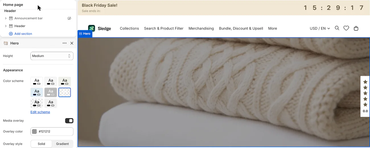
The "Height" setting decides the banner's size in both themes. Dawn calls its banner section Image banner, and Horizon calls it Hero. Your picture scales up until it covers the box, and the rest is trimmed evenly, or around your focal point.
| Theme and Height | 1440 x 900 laptop: box | Height a 2:1 picture keeps | 390 x 844 phone: box | Width a 2:1 picture keeps |
|---|---|---|---|---|
| Dawn Small | 1440 x 420 | 58% | 390 x 288 | 68% |
| Dawn Medium | 1440 x 560 | 78% | 390 x 340 | 57% |
| Dawn Large | 1440 x 720 | All of it | 390 x 390 | 50% |
| Horizon Small | 1440 x 384 | 53% | 390 x 243 | 80% |
| Horizon Medium | 1440 x 519 | 72% | 390 x 340 | 57% |
| Horizon Large | 1440 x 654 | 91% | 390 x 500 | 39% |
| Horizon Full screen | 1440 x 834 | 86% of its width | 390 x 784 | 25% |
Measured November 2, 2026, on Shopify's demo stores (Dawn 15.0.0, Horizon 3.2.0): two of the ten screens we tested. Boxes include the demo's words, so more text can make a box taller.
On a 390-wide phone, Horizon at Large keeps 39% of a 2:1 banner's width. The laptop keeps 91% of its height, so the problem hides until you check your phone.
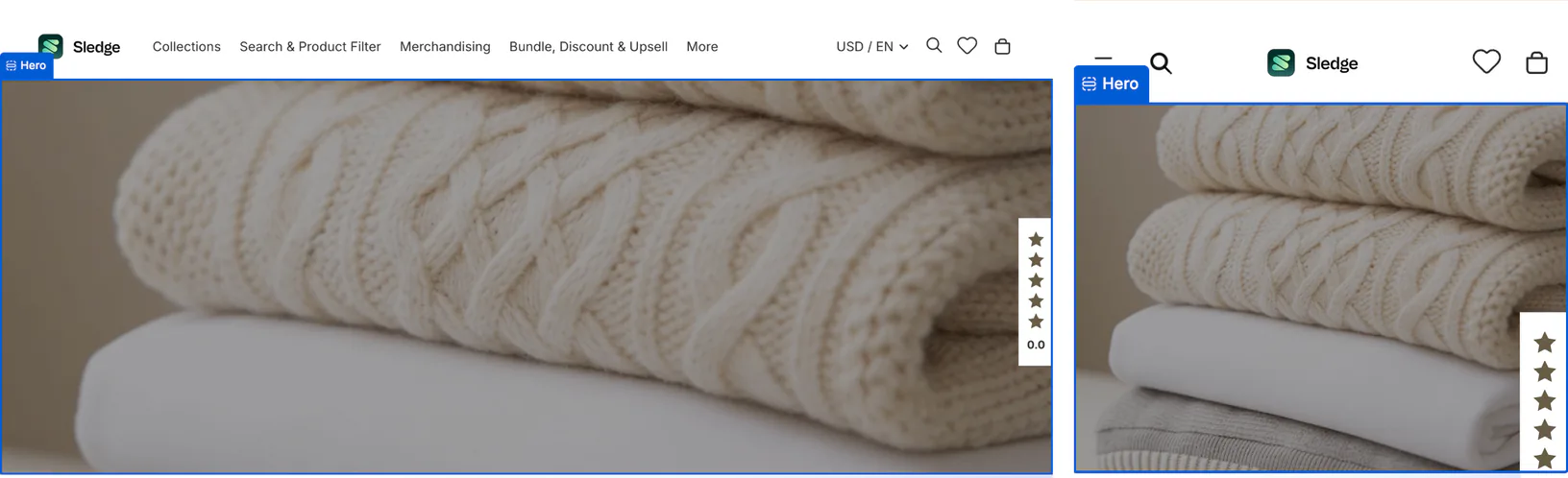
Dawn's height is fixed in pixels, so a wider screen gets a thinner box: on a 1920 monitor, Medium keeps 58% of the height. On laptops and monitors, Horizon's height follows the screen, so its shape holds. The theme editor's preview can be narrower than a real screen, so check a wide monitor too.
A fresh Dawn homepage uses Large, a fresh Horizon homepage Medium, and a newly added Hero Large. Dawn versions before 15.3.0 call Height "Banner height" and hint at a 3:2 picture. At Large, that keeps more of the width on a 390-wide phone (67% against 2:1's 50%) but only 75% of the height on a 1440 laptop.
Why is your banner cut off on mobile?
A phone's box is close to square, or taller in Horizon at Large. Wide pictures can lose their left and right on tall screens, Shopify says.
Text over the picture can make the box taller than its setting, which trims more of the sides. On a phone, Horizon Small measured 243 tall against the 180 its setting gives. If deleting the heading fixes your crop, this was the cause.
Your words are in the picture. You put the sale line on the banner in Canva, and visitors see it cut off. Shopify says pictures in slideshows or backgrounds shouldn't carry text, because it can be moved or cropped. Type the words in the theme editor instead.
Rehearse on a real phone, as the Black Friday checklist says.
How do you stop a Shopify banner being cropped?
In Horizon, add a phone picture. In Dawn, move the text below the picture. Everything here is free but the last fix, which needs a developer.
Pick the Height first
On a laptop, Dawn's "Adapt to first image" sizes the banner to your picture, so a 2:1 picture shows whole at 1440 x 720.
Horizon's Auto shows the whole picture only when the Hero has no text or buttons. With text, the box shrinks to 1440 x 302 on a laptop, where a 2:1 picture keeps 42% of its height.
In Dawn, move the text off the picture
Dawn can show the whole banner on a phone with two settings and no code. Set Height to Adapt to first image and, under "Mobile layout", tick "Container" ("Show container on mobile" on older versions), which puts your text below the picture. A 390-wide phone then shows the whole 2:1 picture, 195 tall.
Leave the text on the picture and the box can grow: the demo store's words pushed it to 390 x 288, where a 2:1 picture keeps 68% of its width. At Small, Medium or Large, the same tick holds the box at 280, 340 or 390 tall whatever you write. A newly added Image banner has it ticked, and a fresh Dawn homepage doesn't.
Set a focal point
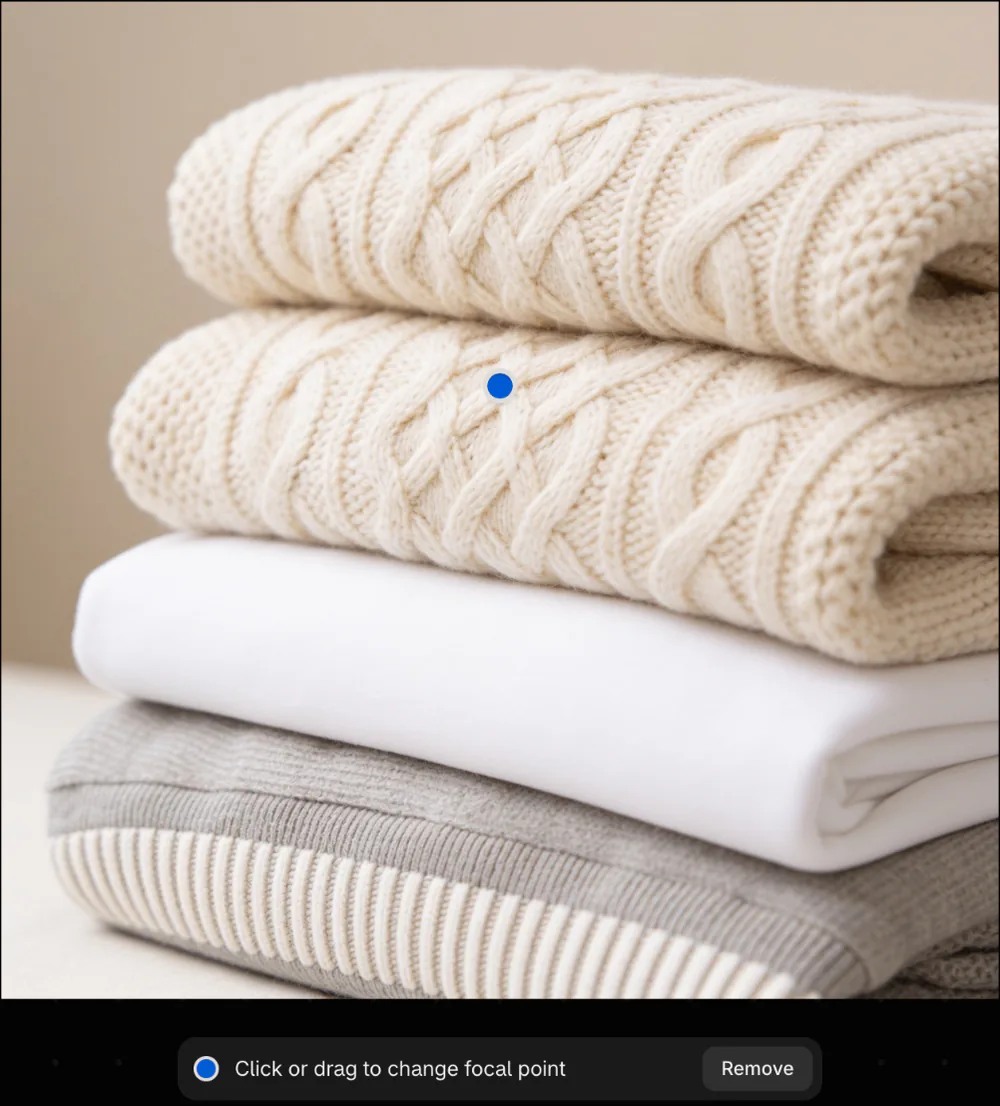
A focal point marks the part of the picture that stays in frame, though not always in the center. It moves the crop without showing more, which helps when you'd rather lose the opposite edge.
In the theme editor, hover the picture in the section's settings and click the pencil, or open it under Content, then Files. Where the panel says "Click image to set focal point", click your subject, and click Save. Each picture holds one, and it follows that picture everywhere you use it. Shopify's Help Center lists all Horizon family themes and Dawn 7.0.0 and higher as supported.
In Horizon, add a phone picture
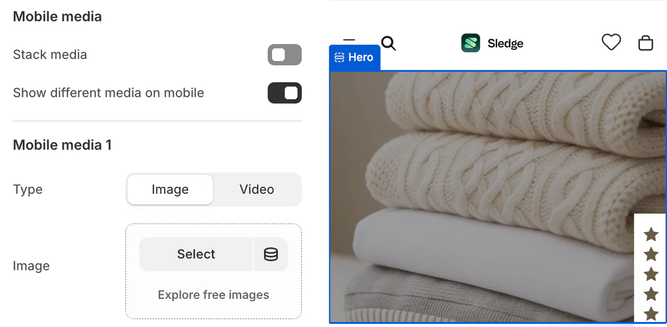
Tick "Show different media on mobile" and a "Mobile media 1" group opens with its own Image field. Add a 1600 x 1600 px square, or 1600 x 2000 px at Large. The setting dates from Horizon 3.1.0. It takes over below 750 wide, so an upright tablet keeps the desktop picture.
By the boxes we measured, the square keeps 79% to 94% of its height at Medium and 56% to 68% at Small. At Large, 1600 x 2000 keeps 90% to 98%, depending on the phone.
A phone picture can also fix blur. A big upload can look soft because the crop zooms in: Horizon at Large uses a 1200-wide version on a 390-wide phone, then stretches it about 2.5 times.
Keep the subject in the middle
On a 2:1 picture at Medium, the middle half stayed on every screen we measured up to 1920 wide: 53% of the width and 58% of the height.
Four setups keep less. At Large on a Horizon phone with no phone picture, only the middle third of the width stays. Dawn keeps 44% of the height at Medium on a 2560-wide monitor and 46% of the width at Large on a 360-wide phone. Small keeps 44% to 61% of the height from 1366 to 1920 wide.
In Canva, set a custom size of 3840 x 1920.
Add or change the banner
- In Online Store, click Edit theme.
- Click your Image banner or Hero section.
- In the Image field, click "Select image".
- Click "Add images", pick your picture, and click "Done".
- Click "Save".
To crop inside Shopify, open the file, click "Crop and transform", pick Freeform, Original or Square, then click Apply and Save. No 2:1 choice is listed, so use Freeform by eye.
In Dawn, pay for a phone picture
Dawn has no phone picture slot. "Image 2" ("Second image" before 15.3.0) isn't one: it sits beside the first picture on desktop, each at half the width, and stacks under it on phones.
A developer can add a phone slot for a different picture on phones. You pay for the work, plus a check at every theme update, since a conflicting change has to be copied over by hand.
What size are slideshow, collection and header banners?
Slideshow: on Dawn, the same as a full-width banner, with every slide one shape. Adapt to first image matches the first slide, so other shapes still get cropped. We couldn't pin down Horizon's Slideshow box, so check yours on a real phone.
Collection: 1200 x 600 px on Dawn. It's the collection's own picture, shown only after you tick "Image" ("Show collection image" before 15.3.0) in the Collection banner section, which is off on a fresh store. The box is 550 x 200 on a laptop and 360 x 200 on a phone, and a long description can grow it. A 2:1 picture keeps 73% of its height on that laptop and 90% of its width on that phone. Horizon's default collection page shows a title and no picture. Product photos in the collection grid have their own sizes, covered in Shopify product image size.
Header: the big picture at the top of your homepage is the Image banner or Hero above, so use those sizes. The announcement bar over your header holds words, not a picture, and you can schedule it for a sale.
What if your theme isn't Dawn or Horizon?
We didn't measure it, so don't assume these numbers carry over. On a paid theme, start with its documentation: in Online Store, click Edit theme, open the three-dot menu, and click View documentation.
Then measure your own box: screenshot the banner on your laptop and phone, and compare width to height. Match your picture to the laptop's shape, and to the phone's if your theme has a phone slot. We left out the rest of the Horizon family too, so look for a section named Hero and the same Height setting first.
What size is a Sledge promo banner?
Sledge is a Shopify app that runs promo banners on your collection pages, search page, search drop-down and cart drawer, in three shapes: 9:16, 16:9 and 21:9. They come with every paid plan. The Promo banner form has one "Upload image" slot per shape, and each takes a JPG or PNG up to 12 MB. Drag the crop frame and the shape stays locked.
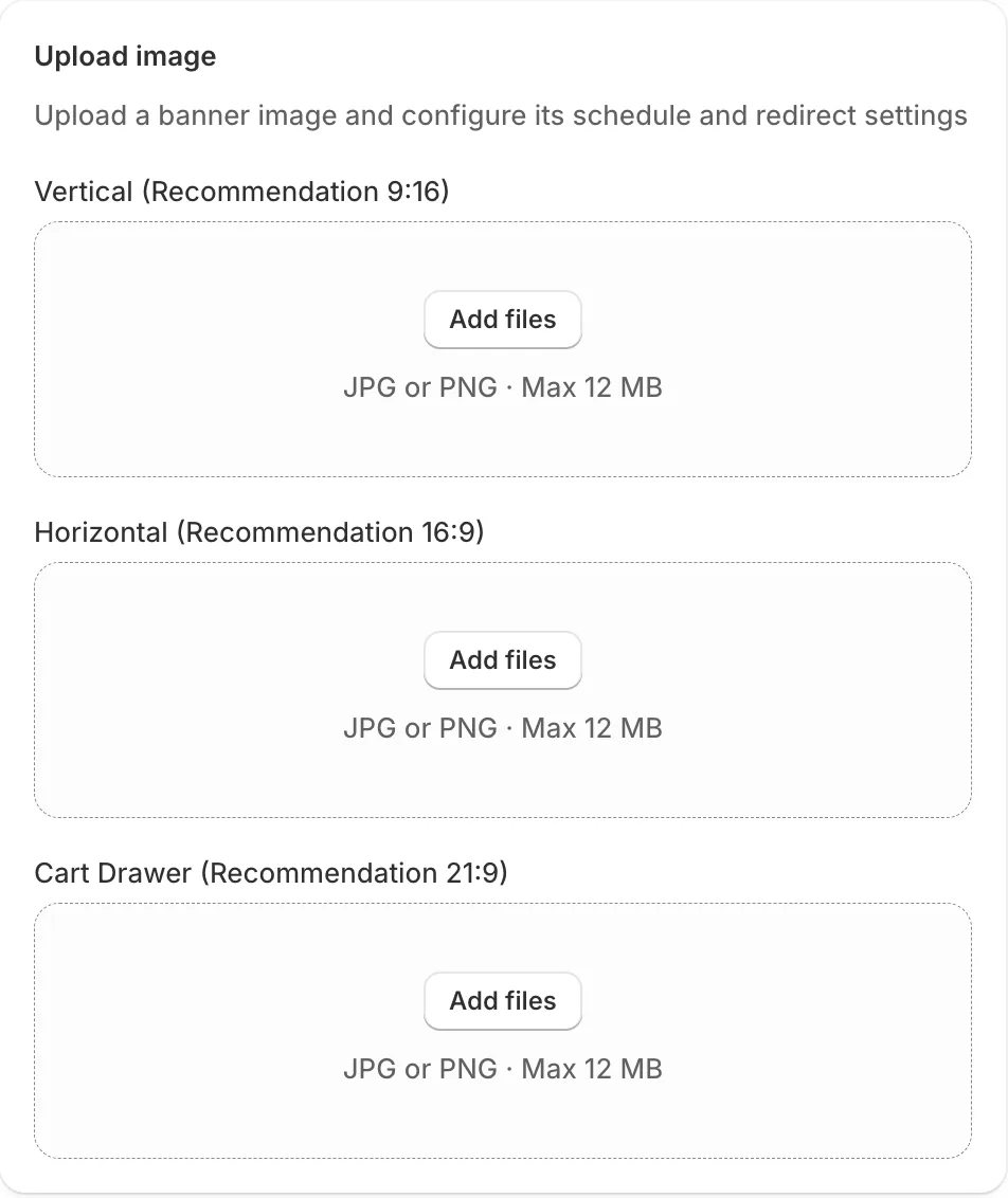
The cart drawer uses the 21:9 picture. Elsewhere, "Image source" picks which picture runs, starting on "Vertical default image". On a collection page, the "At top" position is a strip, so pick "Horizontal default image" there and keep the subject centered, because the strip trims 16:9 too. Sledge has no homepage banner and doesn't resize or crop your theme's pictures, so your theme's banner still needs the sizes above. To time a Sledge banner, see how to schedule a sale banner.
FAQ
Questions, answered
-

14-day free trial
Explore Sledge on your store before you decide to commit.
-

No credit card required
Start improving your store with no upfront commitment.
-

Setup in minutes
Get Sledge running without a lengthy setup process.
-

Built to grow sales
Turn shopper behavior into actions that help you sell more.
What is the best Shopify banner size?
Upload 3840 x 1920 px, a 2:1 shape, for a full-width banner. That is the widest version Dawn and Horizon use in their normal setup, and 2:1 matches a fresh Dawn homepage on a 1440-wide laptop. Shopify's Help Center names no size, so this is our measurement, not Shopify's rule.
What size should a Shopify banner be on mobile?
In Horizon, tick “Show different media on mobile” and add a 1600 x 1600 px square, or 1600 x 2000 px at Large. Dawn has no phone slot. To show the whole picture, set Height to “Adapt to first image” and tick “Container” (“Show container on mobile” on older versions) under “Mobile layout”, which moves the text below it.
Why is my Shopify banner cut off on mobile?
A phone's banner box is close to square, or taller, and a wide picture has to fill it. On a fresh Dawn homepage, a 2:1 banner loses half its width on a 390-wide phone. Text over the picture can make the box taller still, so the phone shows even less of the sides.
What size is a Shopify collection banner?
On Dawn, use 1200 x 600 px, then tick “Image” (“Show collection image” on older versions) in the Collection banner section, which is off on a fresh store. The picture sits in a box of 550 x 200 on a laptop and 360 x 200 on a phone. Horizon's default collection page shows no collection picture.
Does a Sledge promo banner use the same size?
No. Sledge's promo banners have their own form, with three slots: “Vertical (Recommendation 9:16)”, “Horizontal (Recommendation 16:9)” and “Cart Drawer (Recommendation 21:9)”. They run on collection pages, the search page, the search drop-down and the cart drawer. Sledge has no homepage banner, so that one still comes from your theme.
Right size. Now what should it sell?
Try Sledge free for 14 days and run sale banners on collections, search and the cart drawer, each cropped to its slot. Growth Intelligence turns on when you pick a paid plan. It can flag a store running no promo banner, and it totals what its fixes could add in one dollar figure, labeled Est. potential.